NEON CACTUS BEAUTY
BRANDING | PACKAGING | ART DIRECTION

Project context
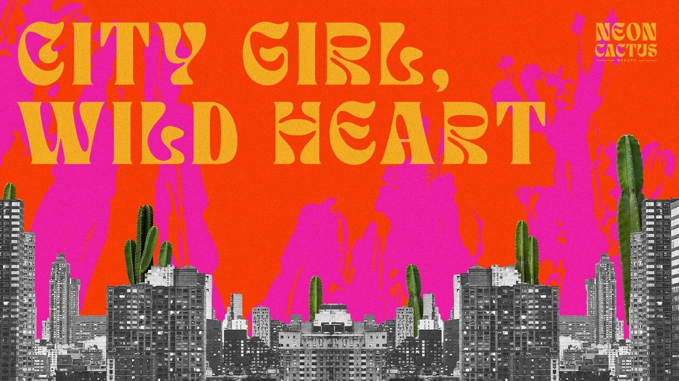
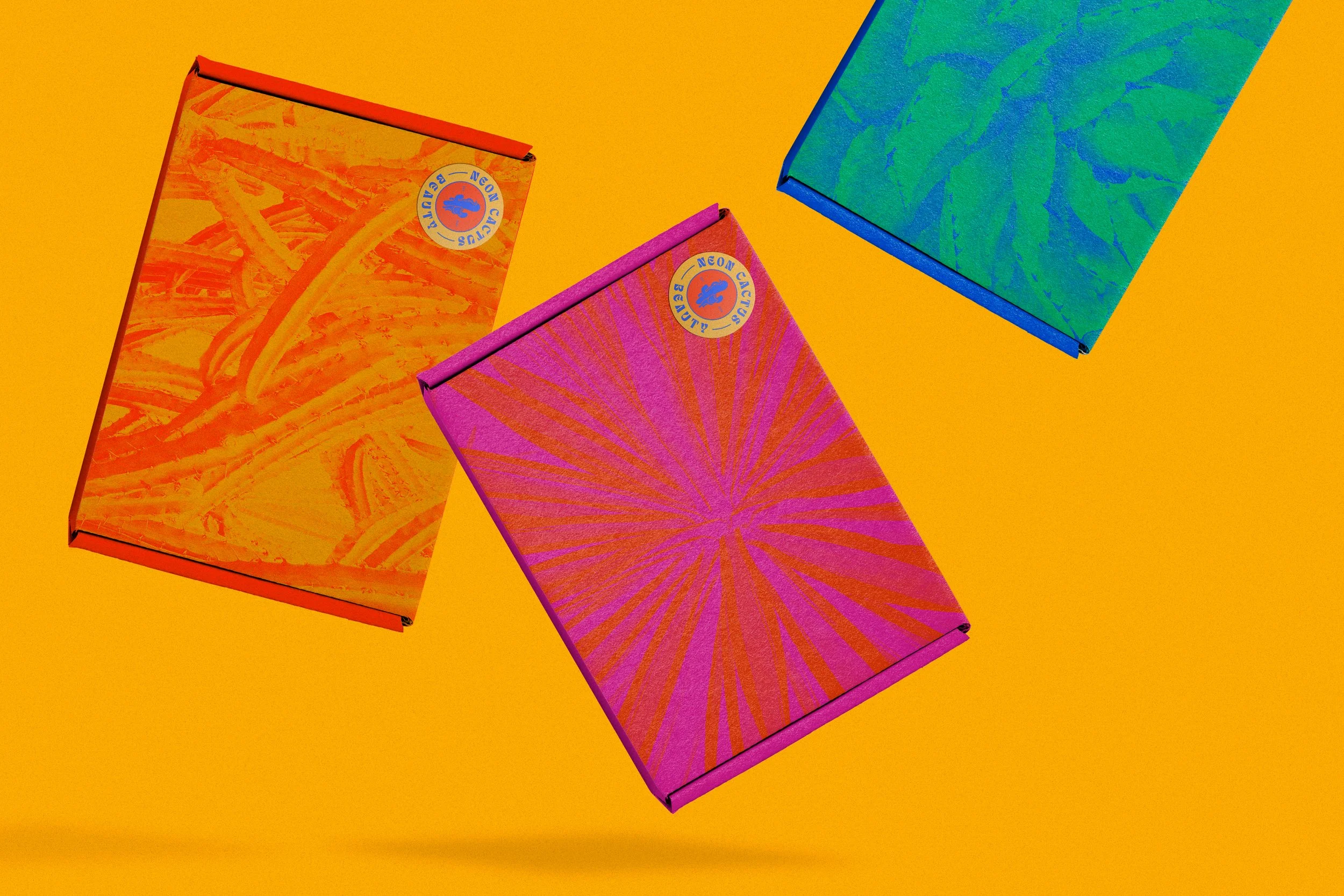
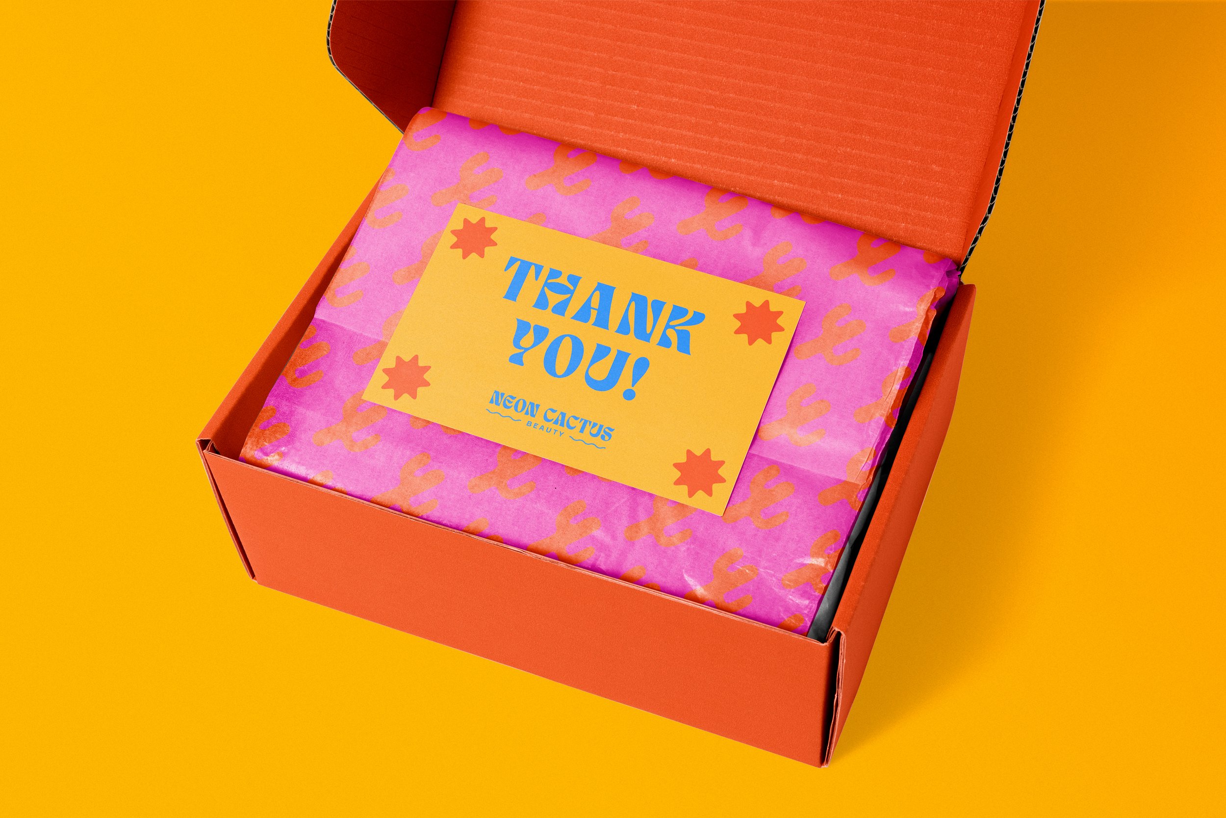
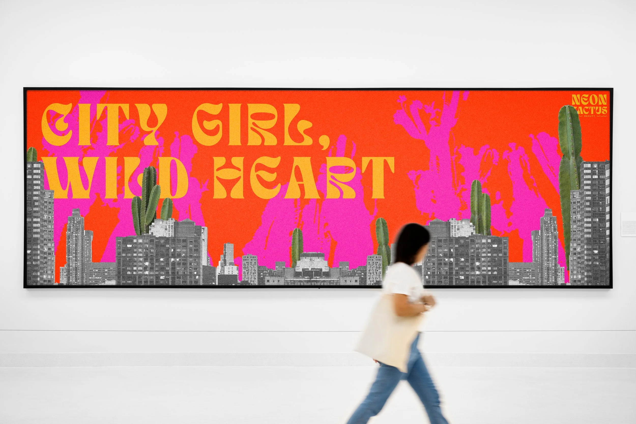
There are thousands of brands that could use a redesign, but I wanted to create something totally new- a brand made in my own image. As a beauty product enthusiast, I decided to design a plant-based hair and skin care line that reflects my own personality. Bold and unapologetic, Neon Cactus is the perfect brand for messy cool girls who love to live life to the fullest, and look good doing it.
design objective
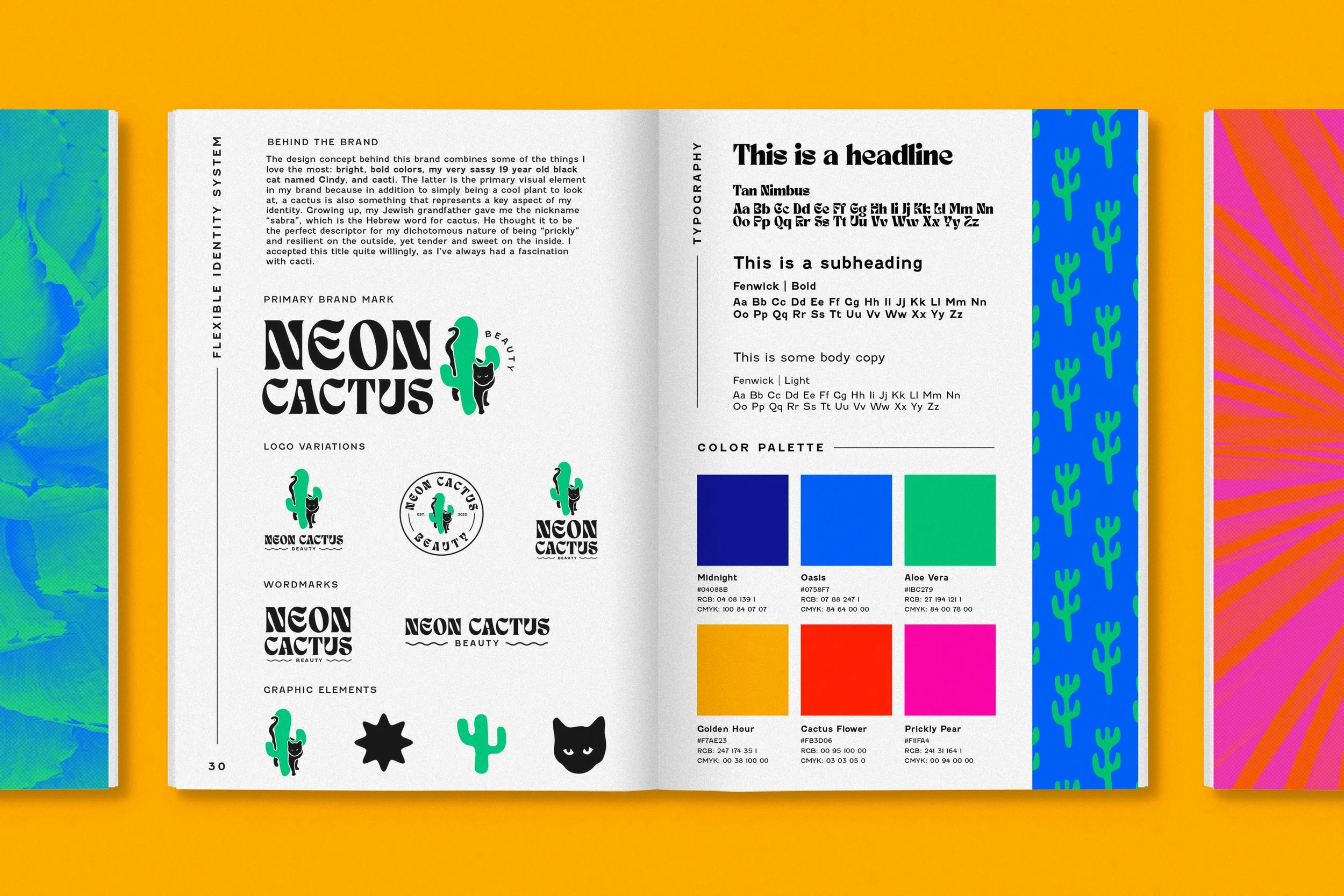
The design concept behind this brand combines some of the things I love the most: bright, bold colors, my very sassy 19 year old black cat named Cindy, and cacti. The latter is the primary visual element in my brand because in addition to simply being a cool plant to look at with a ton of health and beauty benefits, a cactus is also something that represents a key aspect of my identity. Growing up, my Jewish grandfather gave me the nickname “sabra”, which is the Hebrew word for cactus. He thought it to be the perfect descriptor for my dichotomous nature of being “prickly” and resilient on the outside, yet tender and sweet on the inside. I accepted this title quite willingly, as I’ve always had a fascination with cacti.


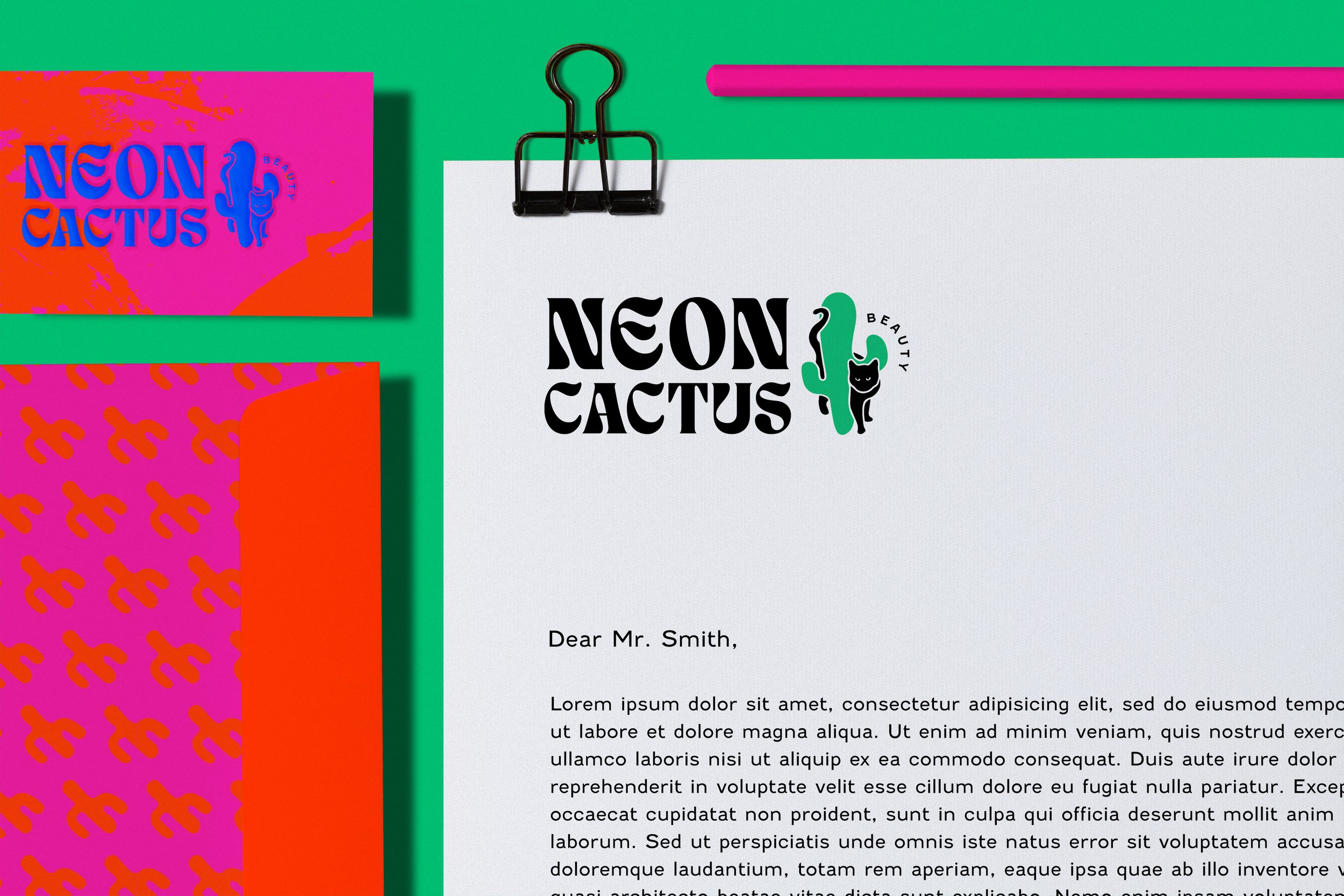
BEHIND the logo
Two symbolic figures near and dear to my heart, the cat and the cactus are known to be resilient forces of the desert. They are the face of the brand to send the message that we, too, are resilient. Just a little self care with this plant-based beauty can bring us back to life.
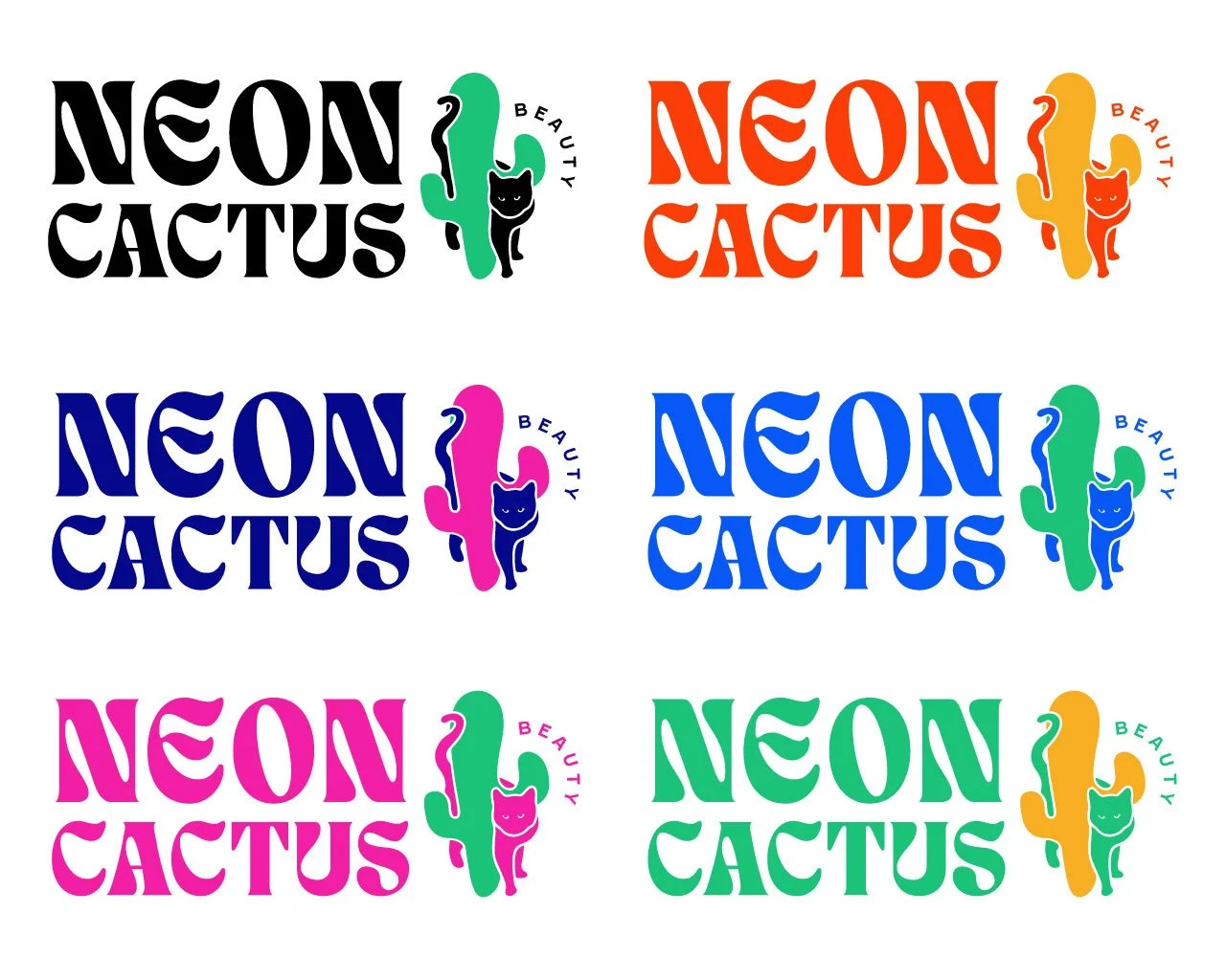
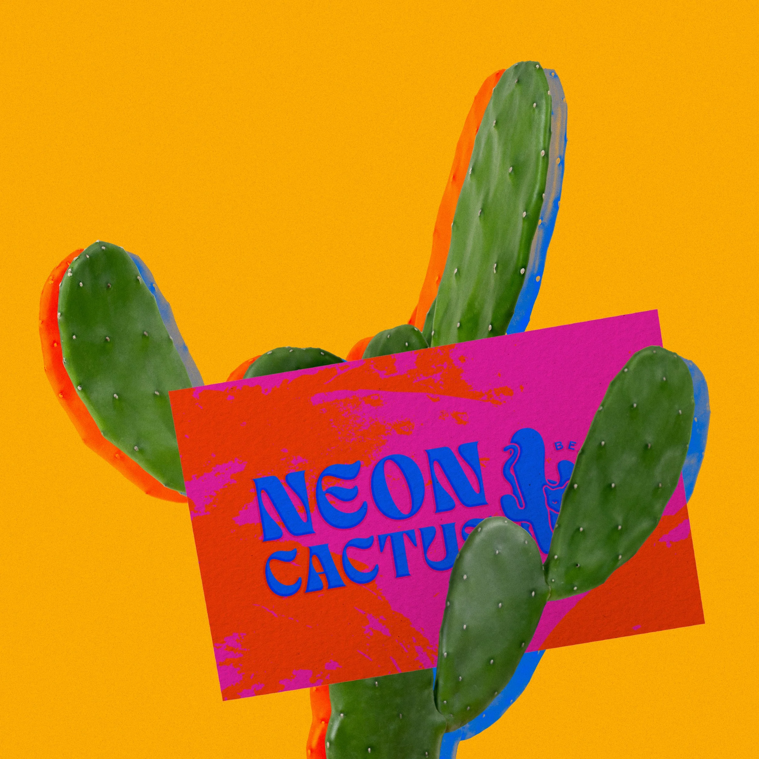
Logo color variations
Brand Visual Identity